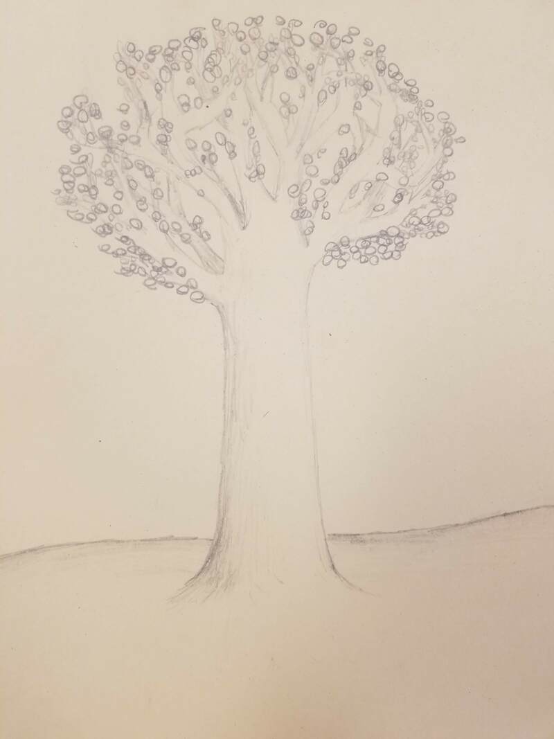
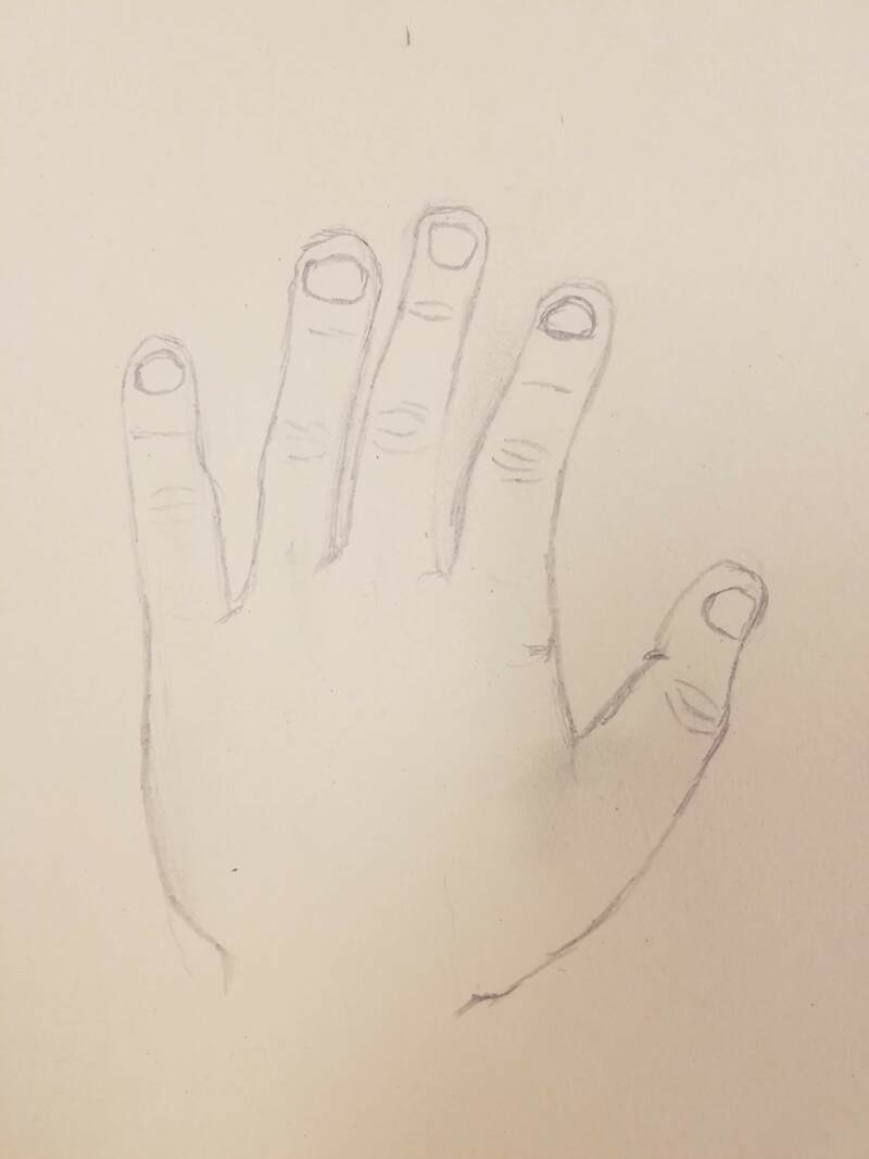
These are sketches from using pencil and colored pencils to show volume, shape, texture.
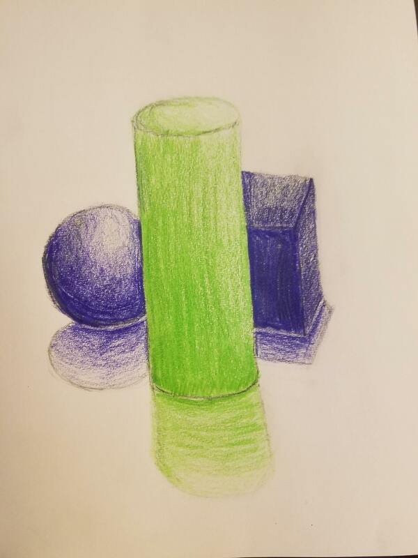
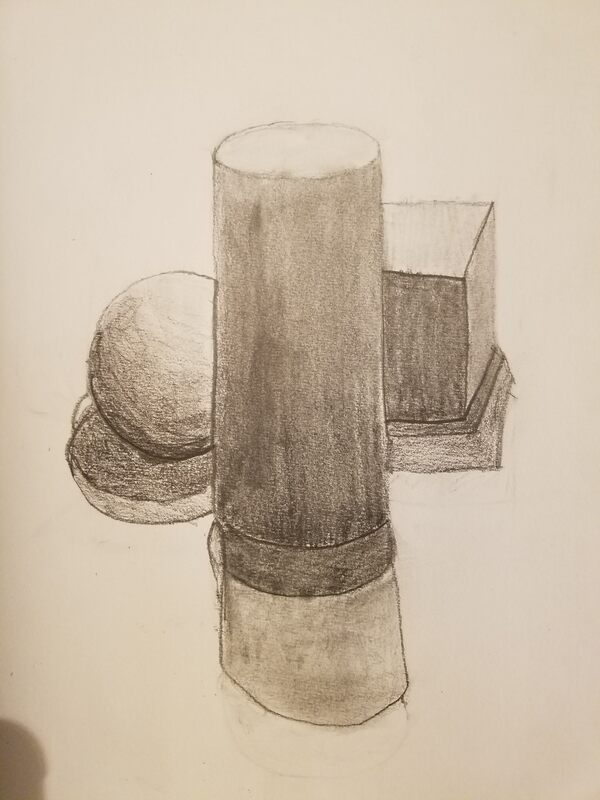
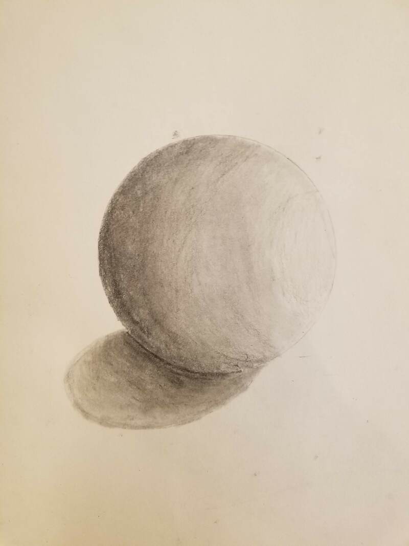
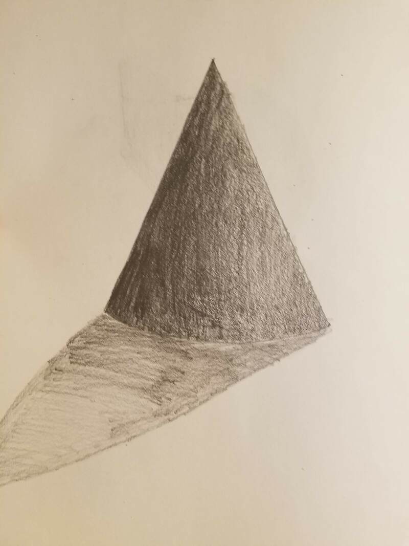
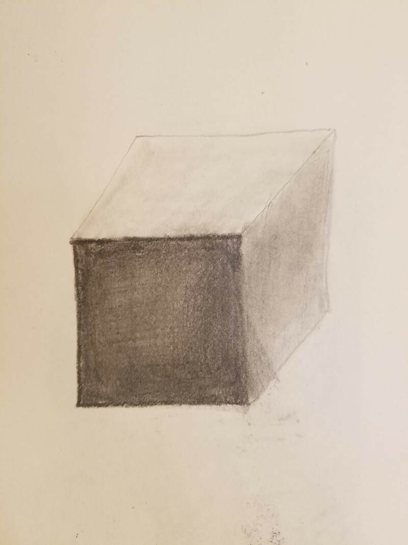
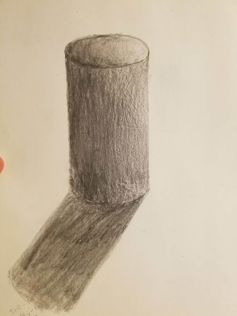
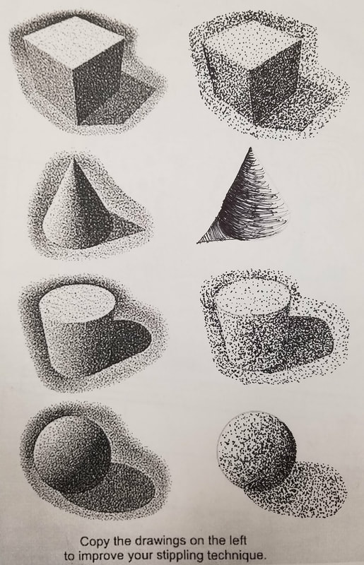
These are the four shapes that we used to practice shading, and a warm up for the still life drawing.
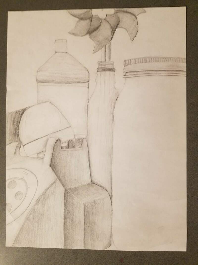
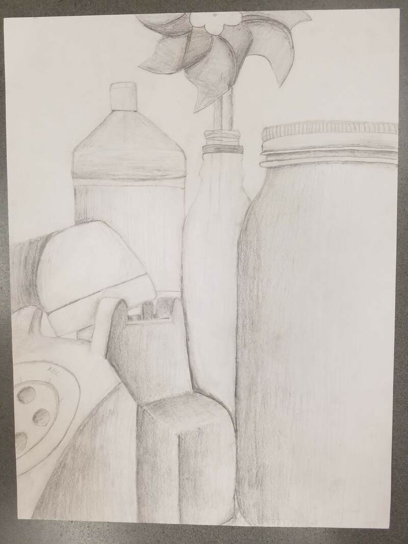
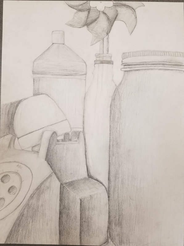
Progress to Final in my still life drawing. I shaded these using pencil, these pictures cannot do it's justice, it does not show the lighter shading I did, in person it is better.
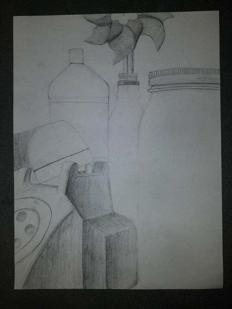
Final Project
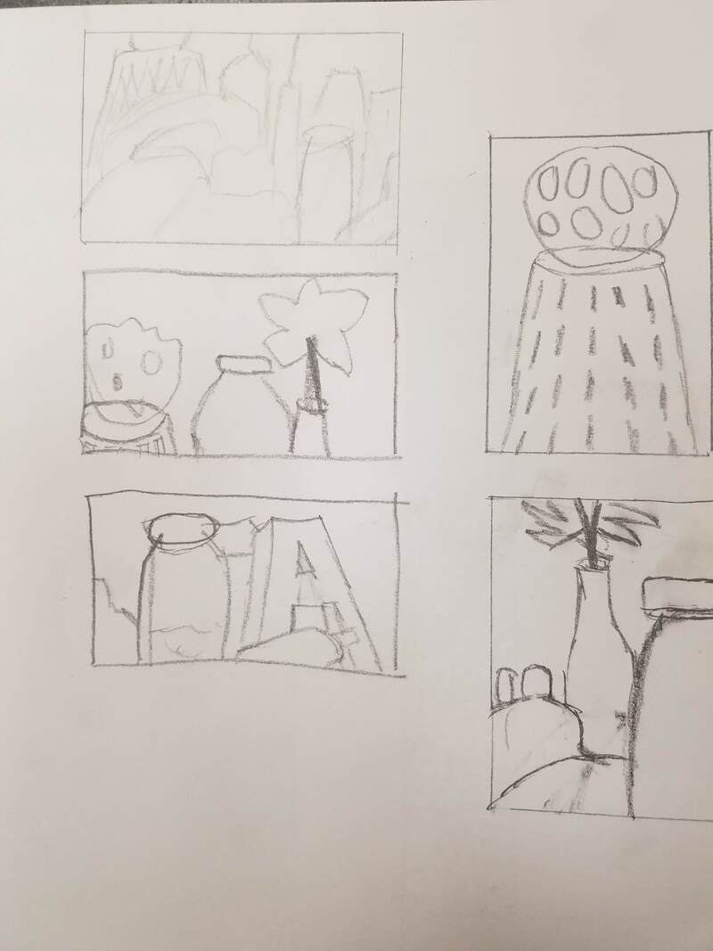
- Describe how you arranged your composition. Discuss your use of the elements and principles. Is it a successful composition? I used the rectangle and tried to fit 3 or four objects in them, and I think I did good with filling the space. On the composition sketches I tried to make them really basic so I could use the real life objects mainly on my final.
- Did you use a wide range of values? (A range from white to black with at least 9 values). Explain how is this evident? I did use a wide range of values. On the telephone there were many shadows covering almost the entire piece, I tried to keep this in mind while shading. Shading on the glass bottles I kept very light to show that they are see through.
- Explain how your knowledge and creating practice studies with value contributed to your piece. Previous work has helped learn how to dark and how light to shade different areas. I knew in between objects I had to make dark to make them not blend. And when objects overlap you have to show the shadows from behind, which help shows value/contrast.
- Describe the blending and transitions in your objects (discuss your use of pressure with pencil and other techniques to achieve this). For the shading I would mostly use the side of my pencil and try to keep lines as close and strait as possible. When shading dark I would more so use the tip of the pencil and gradually go down the side to keep the transitions as smooth as possible. I used what I know on how dark each part should be to help me achieve this.
- Explain how your interpretation of texture is essential in capturing the look of the object. Texture is very important, and shading helps show the texture. For shading on the pinwheel for example you can see by how it is shaded that it is folded over, to make cup for catching air. With the telephone you need to show texture of how each of the sides are corresponding with the shadows.
- If you could recreate your pieces what would you do differently to enhance the final outcome? If I could recreate this piece I would redo the shading. Make it darker, at the dark spots it would be pitch black, and at the lighter spots it would be light grey. I would just want to amplify the shading a bit more.
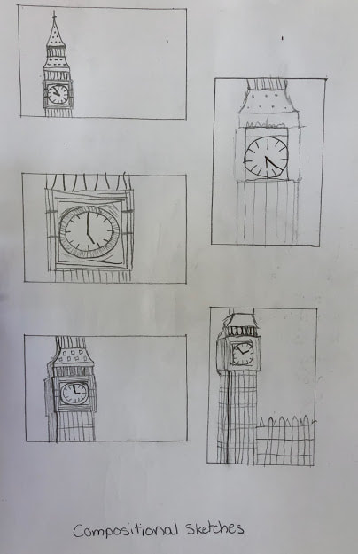
Composition sketches: these were to help us find a good image to make the final from
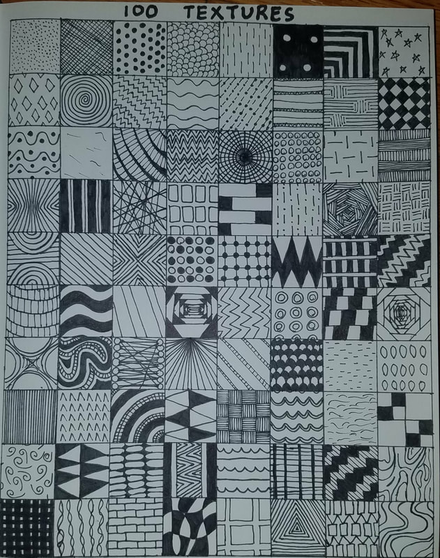
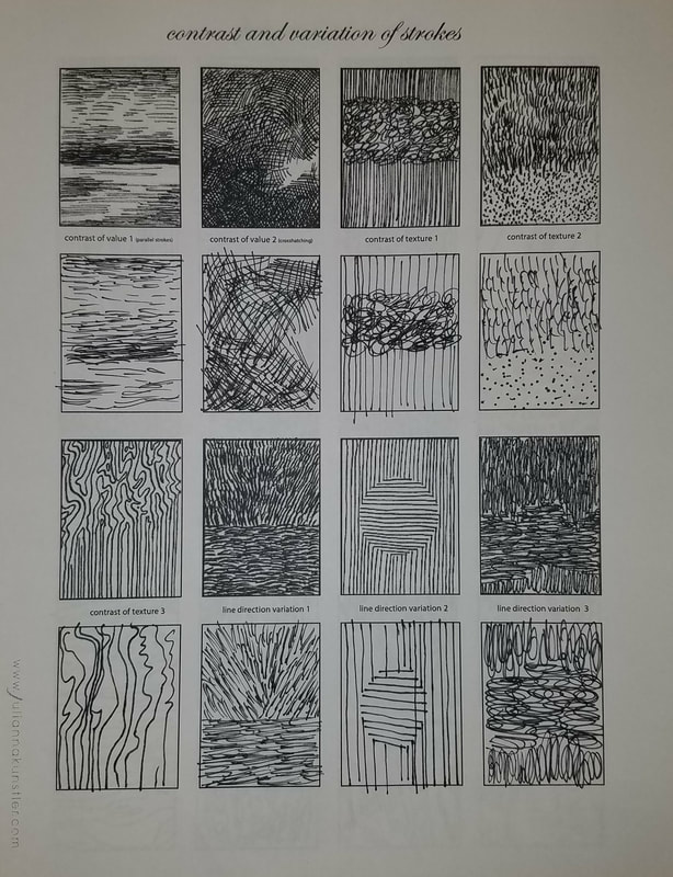
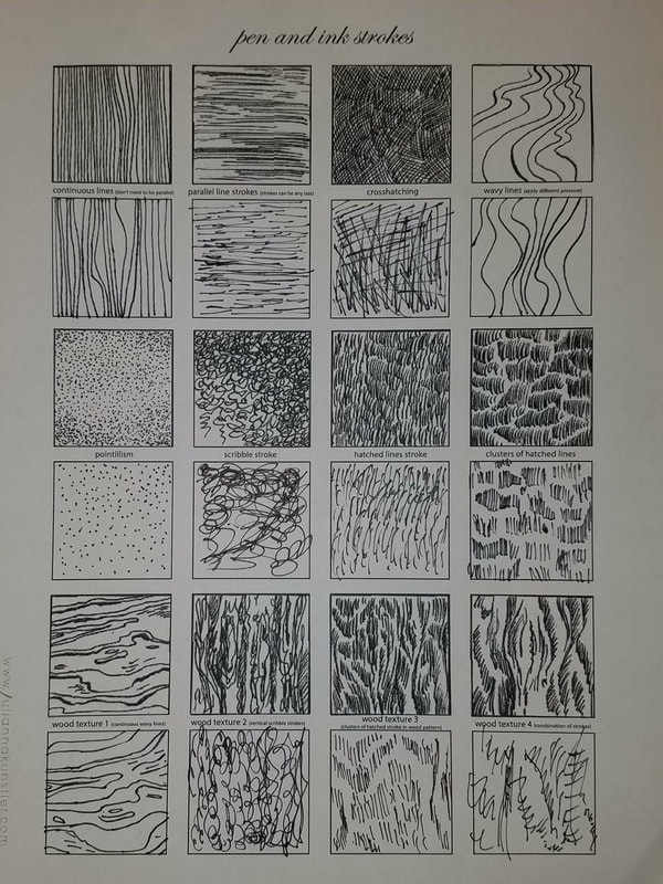
These are the 100 Textures we did using pen and ink, it is to help us figure out our own good, and unique patterns.
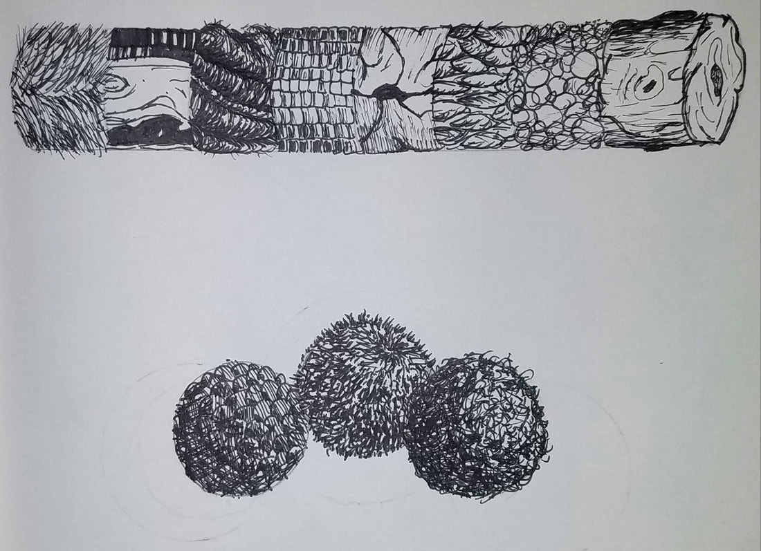
Using different forms to practice our textures. Using fuzzy, hairy, soft, hard, on spheres and a cylinder. Pen value charts to help me practice my light and dark shading.
|
|
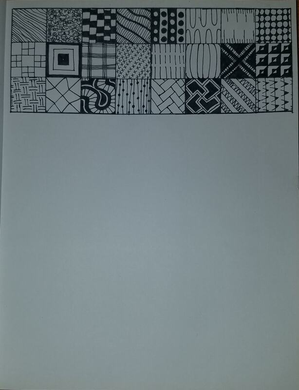
These are the two copy worksheets to help practice my different textures.
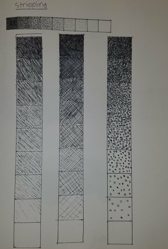
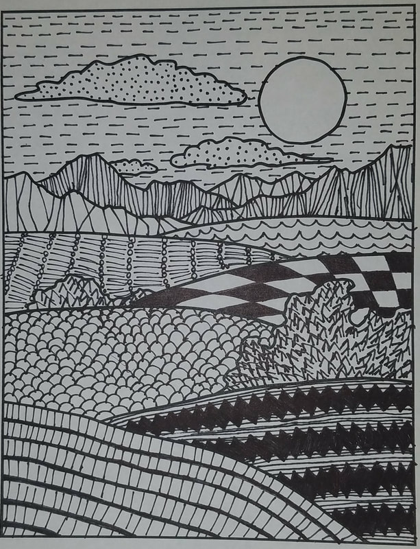
Landscape with different patterns. I used my patterns from the 100 patterns I came up with and made these follow along with the hills, and mountains to show 3-D to make it pop. The practice of stippling is on the left, and this was to practice and make it more of dots then little lines.
|
|
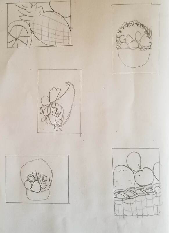
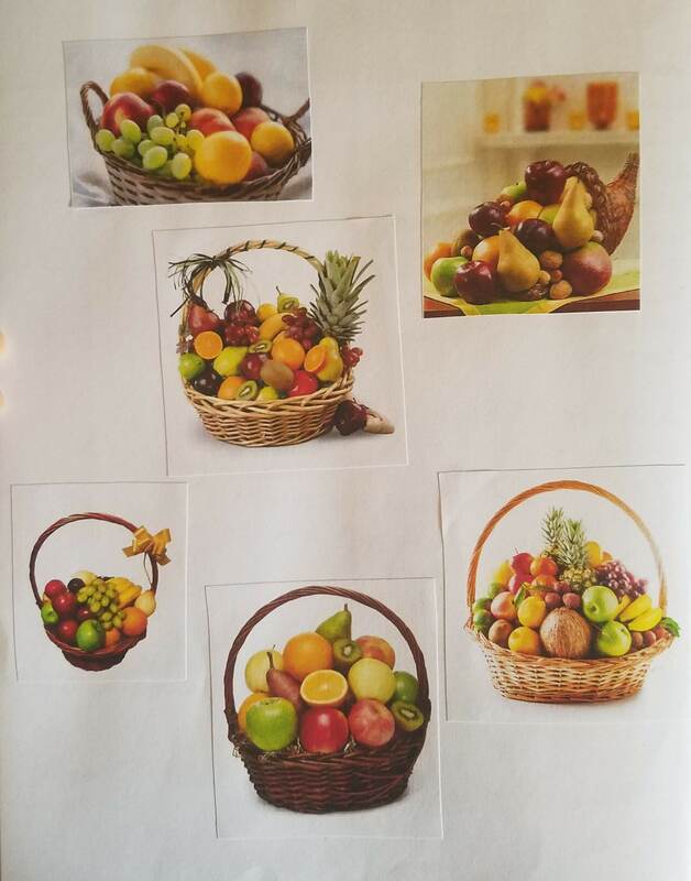
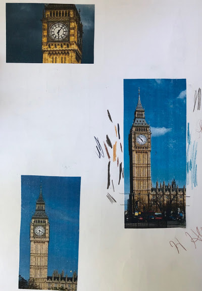
Composition sketches for my pen and ink project. Also some google images I based my project off of.
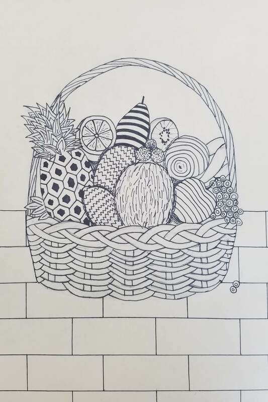
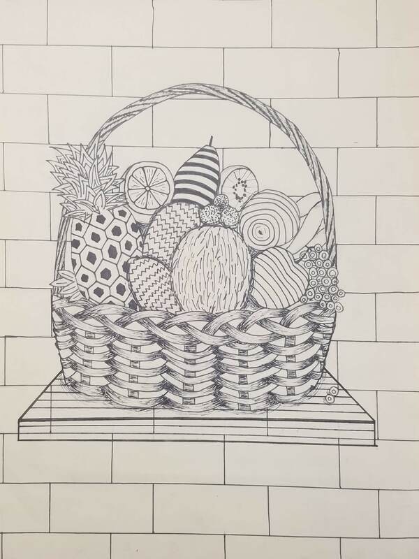
The progression of work throughout my final pen and ink project. Where I started with a light pencil sketch, then over in pen, and then added a table below.
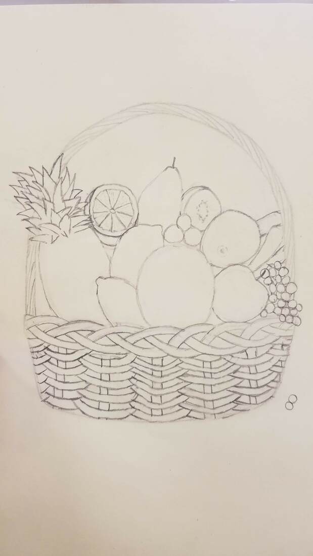
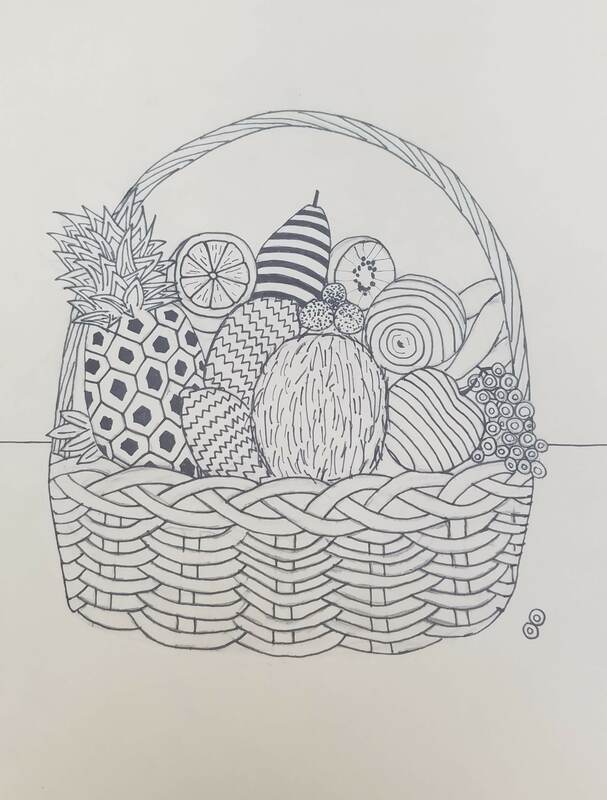
- Describe how you arranged your composition. Discuss your use of the elements and principles. Is it a successful composition? I was inspired to do a fruit basket because they're a lot of different fruits, which all have different patterns. Also that there is a lot of overlapping fruits which would have to show some shading. For elements I mainly used lines and showed texture on the fruits and with pineapple leaves.
- How is texture and pattern are important in your composition? Texture is important because it showed each fruit from each other, so you can tell which is an apple, which is a pear, etc. I also had to keep the same pattern for each type of fruit. The use of texture on the basket shows the weaves overlapping, and made from rope.
- Why is value so important in this project? Value is important in this project because it shows how which fruits are in front of the basket and which fruits are in the back of the basket. It helps make this project look 3 dimensional.
- Describe your craftsmanship (How well the project is crafted technically). My craftsmanship shows good quality, and my project looks like it was a drawing with pencil, but actually pen. My project is well put together with lines strokes being strait when they need to be strait, and curved when they need to be curved.
- Explain how your knowledge and creating practice studies with value and pattern contributed to the success of your piece. The practice and sketches I did helped me make my final project. With the 100 different textures it gave me good ideas on what to do for each fruit. I also has to practice hatching which helped show depth on the basket.
- When applying the pen and ink/pattern techniques why and how is it important to make sure you understand the concepts taught in class? It was important to understand the concepts we did in class because it really helped with shading. If I did not learn how to do hatching with the class, I would not be able to finish this project.
- As a growing artist how do you think what you have learned will guide and better your future projects. Explain. This was my first pen and ink project and I think I did pretty well. It shows all concepts of what we learned, and now when I do another pen and ink project I will be successful. I really enjoy pen and ink projects because of the shading, and how its hard to make depth with pen.
- If you could recreate your piece what would you do differently to enhance your final outcome? If I could recreate my piece I would've thought it more through at the beginning. I put the wall first on my project so then the shelve and the wall patterns interline with each other and make it look less professional. I would also try to use the same pen every time because some of the pens I used had a slightly different darkness of black.
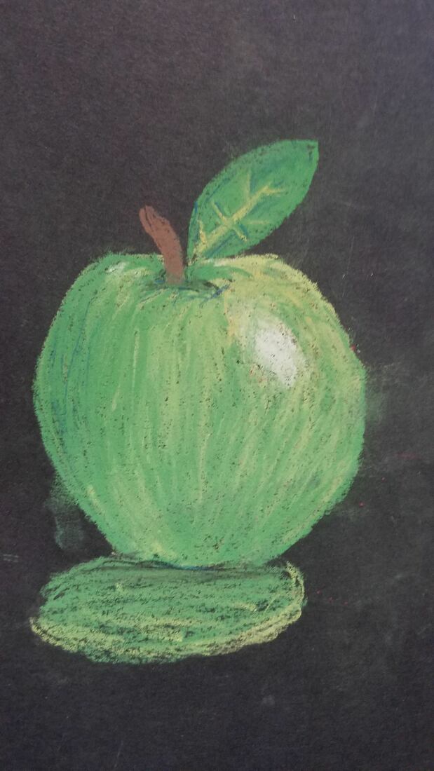
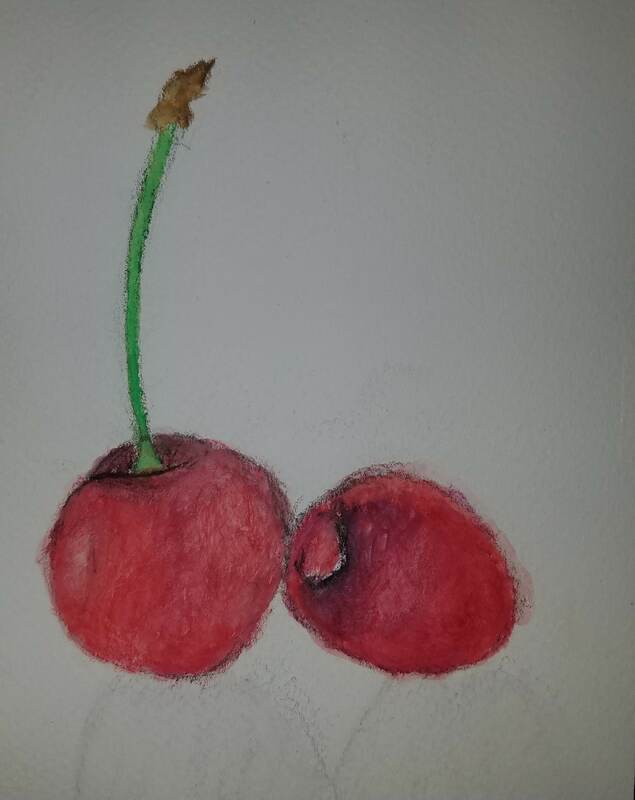
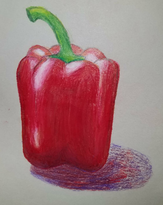
Practice with prism colors, pastels, and watercolor pencils. I used prism colors on the red pepper, pastel on the green apple, and water color pencils on the cherries. We had to practice blending the light and the dark for each fruit/vegetable.
Colored pencil practice drawing
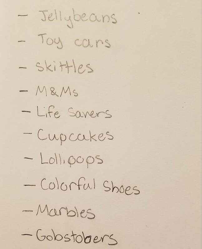
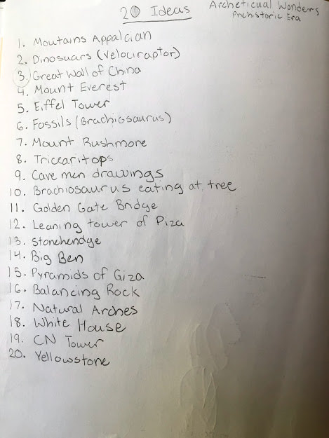
These are the 20 ideas I thought of to do for our colorful project
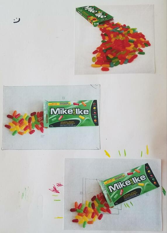
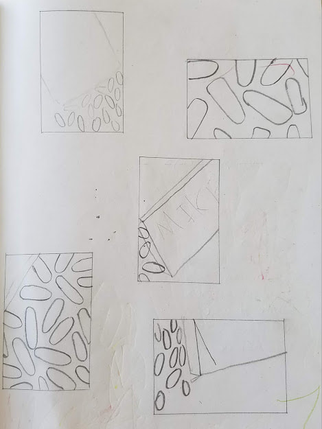
Reference photos and composition sketches for my final
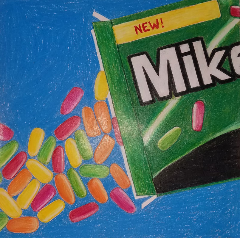
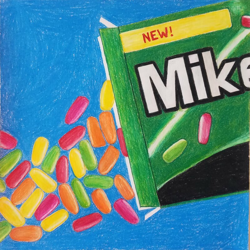
In progress photos for my final colored pencil project
1. Describe the overall composition of your artwork.
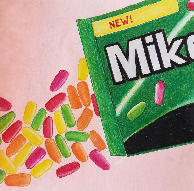
I Chose Mike & Ike's because they have a lot of vibrant colors that would be good for colored pencils. I made the candy like it was pouring out of the box to show depth and volume, and to show movement of the mike & Ike's rolling out the box.
2. How did you use value to create dimension? Is this important? Why?
I used value on each individual candy to show dimension by using light to dark, and by showing reflection on them. Wherever the side of the reflection is I would start it out light, and slowly move darker. This is important because if you did not the image would look two dimensional
3. What did you achieve by using exaggerated color?
When I used exaggerated color I achieved the vibrant and brightness of each color. For each candy I would not just use one color, but I would use many to help create value, which made them look more 3-D.
4. Describe the craftsmanship of your colored pencil/chalk pastel.
The craftsmanship of my project is pretty good about how I laid everything out. The way of the Mike & Ike logo is really good because of the darkness and fullness of the black with the outline. The only thing is I wish I switched the background, I don't really like the blue, and feel it sets the whole piece off.
5. Were you able to achieve depth by showing a foreground, middle ground and back- ground? Explain.
I feel I was somewhat able to show depth with each candy, showing that they each are 3-D, but I did not show the depth of the candy touching the ground as well as I wanted. I wish I could've added better shadows or something to add a more 3-D affect to my piece.
6. Explain your experience with colored pencil/chalk pastel. What were the obstacles and advantages?
My experience with colored pencil was decently good, I liked how you could easily blend colors to make it have more value, but an obstacle was when you already mixed them too much and you couldn't really do anything about it. I also liked the detail you can add with colored pencils, unlike chalk pastels.
Printmaking brainstorm ideas, reference photos, and composition sketches.
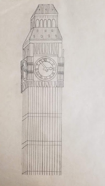
Final Sketch and transfer paper
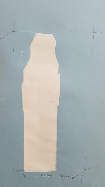
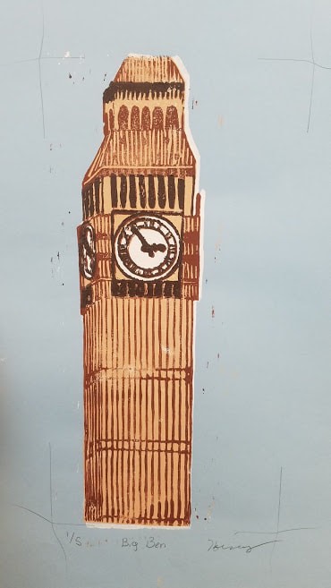
In progress photos of print
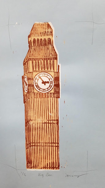
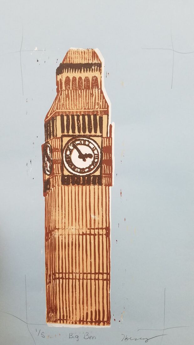
1. Describe the craftsmanship of your prints. (How good the project is technically crafted)
My work on this project is very good, as you can see I carved out each individual line very well. Every line I carved out is not touching another line I don't want it to; I would spend a long time on carving because I wanted to make the prints detailed. For ink coverage I did pretty well as I got enough paint, but was hard for me was trying to not smear the paint. I only smeared the paint on my first print with the white luckily.
2. How did you use texture, color harmony and balance to define your choice of subject?
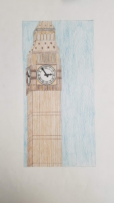
I used texture by making the Big Ben look 3-D, I did this by slanting the lines on the side, to make this building look like it has four sides instead of just two. For color harmony I used lots of different types of browns/tans to help show depth and outline of individual spaces. I showed balance in my work by having the line being parallel and for the other side of the Big Ben you can see the clock but altered as if you are seeing in real life.
3.If you could recreate your pieces what would you do differently to enhance your final outcome?
If I could recreate my piece I would've had a lot more practice prints, because every layer after my first print was fine, but the white (the first print) was off centered for every single one. That is the main thing I would change, but I think I did pretty well, as this is my first time print making.
My work on this project is very good, as you can see I carved out each individual line very well. Every line I carved out is not touching another line I don't want it to; I would spend a long time on carving because I wanted to make the prints detailed. For ink coverage I did pretty well as I got enough paint, but was hard for me was trying to not smear the paint. I only smeared the paint on my first print with the white luckily.
2. How did you use texture, color harmony and balance to define your choice of subject?
I used texture by making the Big Ben look 3-D, I did this by slanting the lines on the side, to make this building look like it has four sides instead of just two. For color harmony I used lots of different types of browns/tans to help show depth and outline of individual spaces. I showed balance in my work by having the line being parallel and for the other side of the Big Ben you can see the clock but altered as if you are seeing in real life.
3.If you could recreate your pieces what would you do differently to enhance your final outcome?
If I could recreate my piece I would've had a lot more practice prints, because every layer after my first print was fine, but the white (the first print) was off centered for every single one. That is the main thing I would change, but I think I did pretty well, as this is my first time print making.
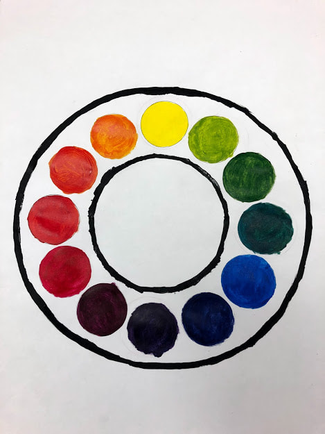
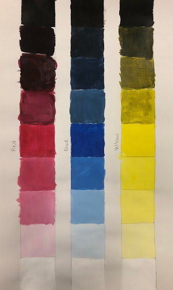
Painting Value Chart, and creative Color Wheel
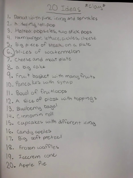
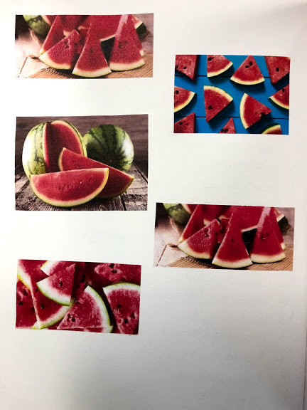
20 Ideas for clay, and reference photos
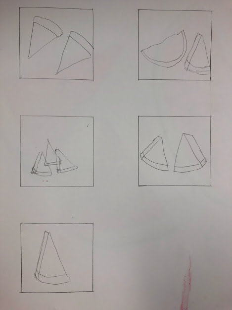
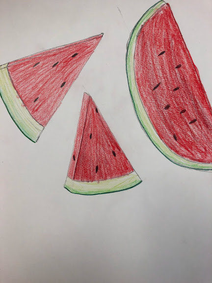
Composition sketches, and final sketch
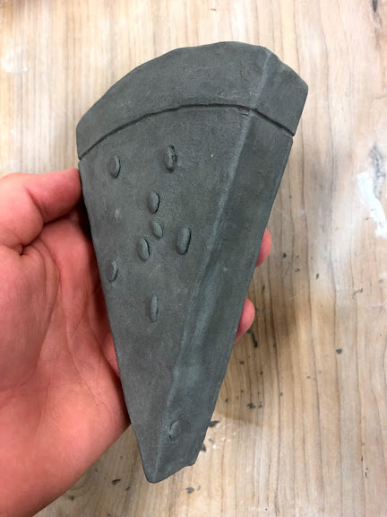
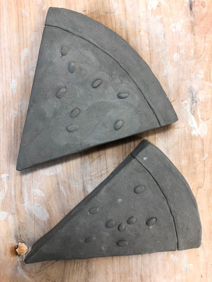
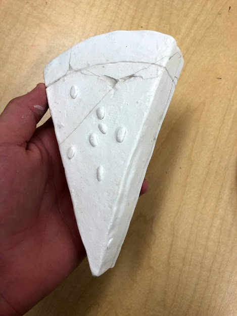
In progress pictures leading towards final project
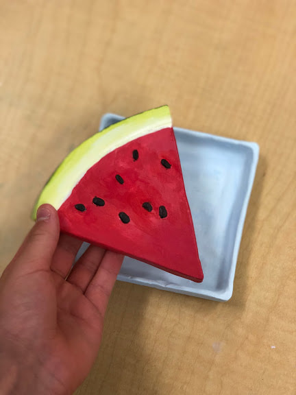
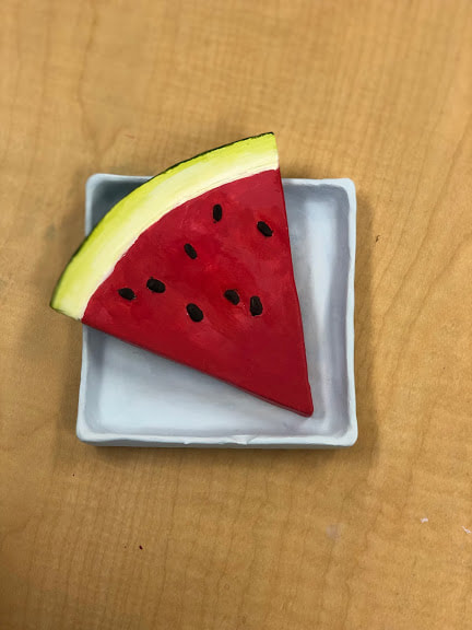
1. Describe the craftsmanship of your sculpture. (Is it neat and well executed?)
The craftsmanship of my sculpture was neat and tidy, it was well executed because I feel I made the right shape for the watermelon and the right thickness.
2. What was the most difficult part of this project?
The most difficult part of this project was honestly finding the right colors when painting. Blending the right amount of magenta, white, and bright yellow to get the perfect watermelon color was very frustrating. Another difficult part of this project was having to re-glue the watermelon that exploded.
3. Did your color choices work together harmoniously?
My color choices indeed did work together well, as I had the perfect watermelon color, for the melon and for the rind. I like how the very light blue plate makes the watermelon pop, because there are no hard contrasts in between these colors.
4. Is your sculpture interesting from all views?
My sculpture is interesting from all views because each side of the watermelon and of the plate are painted. The watermelon how ever is placed on the plate looks nice, and that's what I like about this piece, it can display however you want it to.
5. Describe the differences in constructing a sculpture and doing something 2D.
The differences in doing a sculpture than doing 2D is all the angles you have to keep in mind when making a 3D piece, also that you can make whatever you are creating look more realistic, as it is in 3D.
6. How did you create textures in your sculpture?
I created textures by using the paint to show the textures that the watermelon has. For the red paint I had blauches to show the watermelon texture, and for the rind of the watermelon I had it crisp to show its sharp.
7. Does your sculpture look like the actual food? How did you accomplish this?
My sculpture does look like the actual food from far away, because of all the colors and shape, but when the item is closer people can tell that watermelons aren't that perfect. I mean this by all watermelon slices have imperfections.
8. What would you do differently if you were to do this project again?
First of all if I were to do this project again I would poke a hole in my sculptures so that way they don't blow up like last time. Also I would've tried to make the plate more strait, even, and balanced then it is right now.